

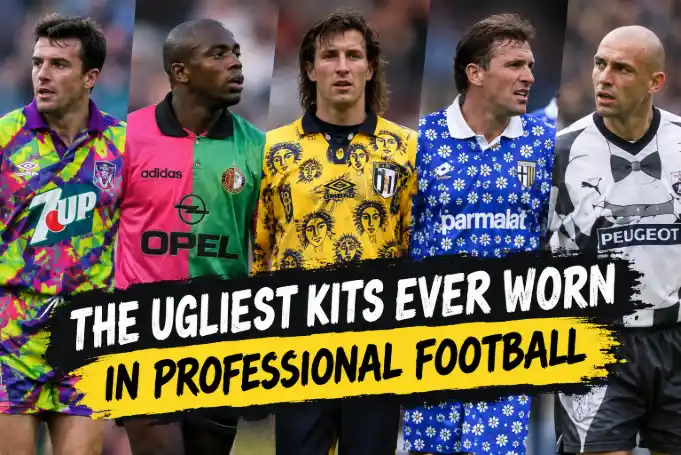
The Ugliest Kits Ever Worn in Professional Football
Every fan loves a clean jersey, but kit manufacturers sometimes create genuine atrocities. Whether born from reckless 1990s neon experimentation, deliberate publicity stunts involving food and muscles, or tactical blunders that forced halftime wardrobe changes, these shirts went horribly wrong. When team fashion fails this spectacularly, it lingers in the memory almost as painfully as the most painful defeats in football history and the fans who never recovered from seeing their club humiliated on the pitch.
Football kits are supposed to inspire loyalty, evoke civic pride, and make players feel ten feet tall when they stride out of the tunnel. Most of the time, designers play it safe. They roll out crisp vertical stripes, classic sash motifs, or pristine monocolor palettes that please corporate boardrooms and supporters alike.
Every now and then, though, sanity leaves the room.
Someone inside a design studio gets a budget, open creative freedom, and perhaps far too much caffeine. The result is a shirt so violently repulsive that you cannot take your eyes off the screen. Over the decades, we have seen professional clubs trot out onto the pitch dressed as walking biology diagrams, condiments, and fuzzy television static.
So let us take an honest walk through football fashion purgatory and examine the ugliest shirts to ever grace the professional game.
1. The Spanish Lower-League Carnivals: Flesh, Tuxedos, and Seafood
If you want to find design teams that abandoned all shame, look no further than the regional tiers of Spanish football during the 2010s. For reasons nobody has adequately explained, clubs across the peninsula realized that the quickest way to land international news coverage was to wear literal nightmare fuel.
Take CD Palencia in 2016. Playing in the fourth division, they unveiled a playoff strip designed by Kappa that did away with fabric illusions entirely. Instead, the shirt and shorts featured a hyper-detailed illustration of the human muscular system, stripped clean of skin.
Players looked like anatomical cadavers jogging out of a medical lecture. The marketing slogan was "Nos dejamos la piel" ("We give our skin"), but the visual payoff was sheer body horror. Opposing defenders were forced to mark wingers who looked like animated flesh specimens from an autopsy lab.
Not to be outdone, Cultural Leonesa went in the opposite direction two years earlier. In 2014, they rolled out a kit printed to look like a black formal tuxedo, complete with a printed lapel, white dress shirt, and a clip-on bowtie right below the collar.
Watching players sprint, slide-tackle, and sweat through what appeared to be cheap black-tie rental attire looked completely absurd. Yet it worked on a commercial level, selling out batches across continents within days.
Then came CD Lugo, who decided culinary pride belonged on the pitch. In 2014, they introduced two distinct specialty kits:
- An outfield shirt featuring a giant, bubbly glass of draft beer covering the entire torso.
- A goalkeeper strip displaying a realistic, tentacle-heavy braised octopus arm across the front chest.
It was garish, ridiculous, and undeniably memorable. But as a piece of athletic apparel, it was a crime against optics.
2. The '90s Acid Trips: Hull City, Jorge Campos, and Geometry Madness
The 1990s were an incredible era for football culture, packed with baggy shorts, larger-than-life personalities, and those wild matchday moments that form nostalgic cultural touchstones that only 90s and 2000s kids remember with genuine warmth. But the decade was also an aesthetic minefield.
Cheap dye-sublimation printing hit manufacturing plants, and kit makers went completely wild. Hull City’s 1992/93 home shirt by Matchwinner remains the undisputed king of English kit chaos. Seeking to honor the club's nickname, "The Tigers," they abandoned subtle amber and black stripes in favor of a full leopard-tiger animal print.
The shirt looked less like football attire and more like a faux-fur rug you would stumble across in a tacky roadside motel. It was abrasive, messy, and loud. Yet fans still hold a strange, ironic affection for it today.
Meanwhile, across the Atlantic, Mexican goalkeeper Jorge Campos decided standard team templates were beneath him. Campos designed his own shirts, producing oversized, blinding collages of neon pink, electric yellow, violent purple, and asymmetric zigzags.
During the 1994 World Cup in the United States, Campos was visible from aircraft flying thousands of feet above the stadium. His rationale was legendary: he claimed the dizzying color schemes confused opposing strikers bearing down on goal. Whether it worked on strikers is up for debate, but it certainly punished television viewers.
We cannot skip England either, where goalkeeper shirts became experimental test sites:
- David Seaman’s Euro 96 shirt, which looked like melted rainbow popsicles splattered onto yellow velour.
- Peter Schmeichel’s multi-colored geometric kaleidoscope tops, courtesy of Umbro.
- Ian Walker wearing bright lilac splatters that defied every rule of color harmony.
3. The Tactical Catastrophe: Manchester United’s 1996 Grey Ghost
Most ugly kits merely offend the eyes. Manchester United’s 1995/96 away kit, however, actually ruined games.
Umbro delivered a two-tone dull heather grey shirt that was supposed to pair nicely with blue jeans for casual streetwear. On the rack, it looked drab. On a green football pitch under overcast English skies, it was an optical disaster.
The breaking point came at The Dell on April 13, 1996. United traveled to face Southampton and promptly fell apart, trailing 3-0 by the interval. The players looked sluggish, misplacing simple diagonal balls and misreading runs.
Sir Alex Ferguson was furious. During the break, he demanded his squad take the grey tops off and throw them into the corner of the dressing room. United emerged for the second half wearing their blue-and-white third strip.
Ferguson claimed the players simply could not spot each other when scanning against the crowd in the stands. The grey shirts blended completely into the concrete terracing and sea of spectators. The club was fined by the FA for an unauthorized mid-match uniform switch, but Ferguson did not care. The kit was formally retired and never worn again.
4. Food Stains and Splatters: Athletic Bilbao’s Ketchup Shirt
Centenary and commemorative kits usually get treated with reverence. Athletic Bilbao, a club renowned for its deep Basque traditions and historic red-and-white stripes, decided to take a very different route for their 2004 UEFA Cup run.
They commissioned local Basque artist Dario Urzay to design a special jersey. Urzay wanted to create an abstract work that represented blood, passion, and movement across white canvas. What came off the production line, though, looked like someone had accidentally squeezed a family-sized bottle of Heinz ketchup over a bedsheet.
Amorphous, splotchy crimson blobs dotted the white base in asymmetrical puddles. The reaction from the San Mames faithful was swift and brutal. Supporters felt their historic colors had been turned into a culinary mess.
Bilbao wore the kit in a single pre-season friendly against Dutch side FC Groningen before club management bowed to intense supporter backlash. Urzay was deeply offended by the criticism and requested the club cease production entirely. The jersey was pulled from official club shops, instantly turning it into a rare collector's curiosity.
A Hall-of-Shame Comparison Grid
To put these design choices into perspective, here is how the most notorious disasters stack up against one another across era, intent, and pure visual impact.
| Club / Country | Year | The Design Concept | Why It Failed |
|---|---|---|---|
| CD Palencia | 2016 | Skinless human muscular anatomy | Horrific medical illustration that frightened small children |
| Hull City | 1992 | Literal printed tiger fur texture | Looked like cheap upholstery rather than a sportswear uniform |
| Manchester United | 1995/96 | Two-tone urban heather grey | Blended into the crowd; tossed at halftime after a 3-0 deficit |
| Athletic Bilbao | 2004 | Basque modern art splatter | Widely mocked as spilled condiments; abandoned after one match |
| Football Press Archive | 1978–Present | Various fringe, food, and graphic stunts | Sacrificed competitive dignity for novelty and shock value |
5. Why Clubs Keep Risking Disaster
You might wonder why clubs ever let these kits leave the drawing board. Surely someone in the chain of command could step up and say, "Wait, this looks terrible."
The reality is modern football merchandising operates on intense financial incentives. Standard home kits are locked down by heritage; you cannot dramatically alter Barcelona's Blaugrana or Celtic's hoops without triggering a supporter revolt.
Away and third kits, though, represent total commercial freedom. Manufacturers treat them as high-risk, high-reward gambles. If a bold shirt hits the cultural zeitgeist, it sells out globally. If it fails disastrously, it goes viral anyway, generating millions in free digital engagement.
And strange things happen over time. What looks horrific on launch day often turns into a beloved retro grail twenty years later. The very shirts that fans burned in frustration in 1994 now trade for three hundred dollars on vintage apparel websites. Football nostalgia is funny that way: today's eye-sore is tomorrow's ironic collector's dream.
Frequently Asked Questions
Why did football kits look so chaotic during the 1990s?
The early 1990s saw dye-sublimation printing become cheap and widespread across the sportswear industry. Suddenly, manufacturers were no longer restricted by traditional sewn stripes or solid blocks of color. Designers threw everything at the wall, experimenting with wild jagged geometry, neon tones, and loose cuts before clean minimalism reclaimed the market.
Did Manchester United really blame their grey jersey for losing a match?
Yes, absolutely. During a Premier League match against Southampton in April 1996, Sir Alex Ferguson ordered his squad to strip off the grey kits at halftime while trailing 3-0. He insisted players could not pick out teammates against the crowd background. The fury felt almost as intense as transfer betrayals fans never forgave when their star players suddenly jumped ship to rival clubs.
Are bizarre lower-league kits designed badly on purpose?
Most of the time, yes. Smaller clubs in Spain, England, and across Europe operate on shoestring budgets. Releasing a shirt covered in cured ham, sausage links, or beer foam is a deliberate viral stunt designed to generate worldwide media attention and online orders from collectors.
Can a referee legally ban a team from wearing an ugly kit?
Referees do not hold the power to veto a jersey based purely on aesthetics. However, match officials and governing bodies regularly step in if a kit clashes with the opposition, fails high-visibility requirements, or breaches strict advertising and equipment regulations.
Explore Further
Fascinated by the strangest what-ifs and alternate timelines in the beautiful game? Step back and explore hypothetical crossroads like what if Messi never left Barcelona and five football alternate histories that could have reshaped world football entirely.
